
Kickin’ Through the Ages
Editorial Design
Self-directed academic project
Tools: Adobe InDesign, Adobe Illustrator
April 2019
I've practiced martial arts for most of my life, so when I had the chance to build a full editorial publication, this was the obvious subject. I wanted to go beyond what I already knew, so I spent time researching the origins, evolution, and global expansion of martial arts through books and online sources, and turned everything I found into a 23-page magazine editorial.
The publication is broken into three chapters. The first covers the origins of Kung Fu and Karate, such as where they came from, the secrecy surrounding them, and how they were practiced in their earliest forms. The second looks at how martial arts traveled and evolved across cultures, from Asia to the West. The third focuses on the celebrity effect. It explains how figures like Bruce Lee, Jackie Chan, and Chuck Norris brought martial arts into mainstream culture and changed how the world saw them. Each chapter has subsections that dig into specific topics, and the whole thing closes with a bibliography and image credits.
Every design decision started with the subject matter. Red and black were the obvious palette, with red for the aggression and intensity that martial arts carry, and black for the weight and discipline behind them. The silhouette style for every figure came from how martial arts are almost always depicted in modern media: clean, dramatic, stripped of everything except the movement itself. I wanted the design to feel like it belonged in that visual tradition.
The layout uses a consistent split-page structure throughout. One half carries the color field and imagery, the other holds the text. That rhythm gives the editorial a steady pace that moves the reader forward without feeling repetitive. The timeline spread at the end steps outside that structure intentionally, pulling back to give a broader view of the history in one image.
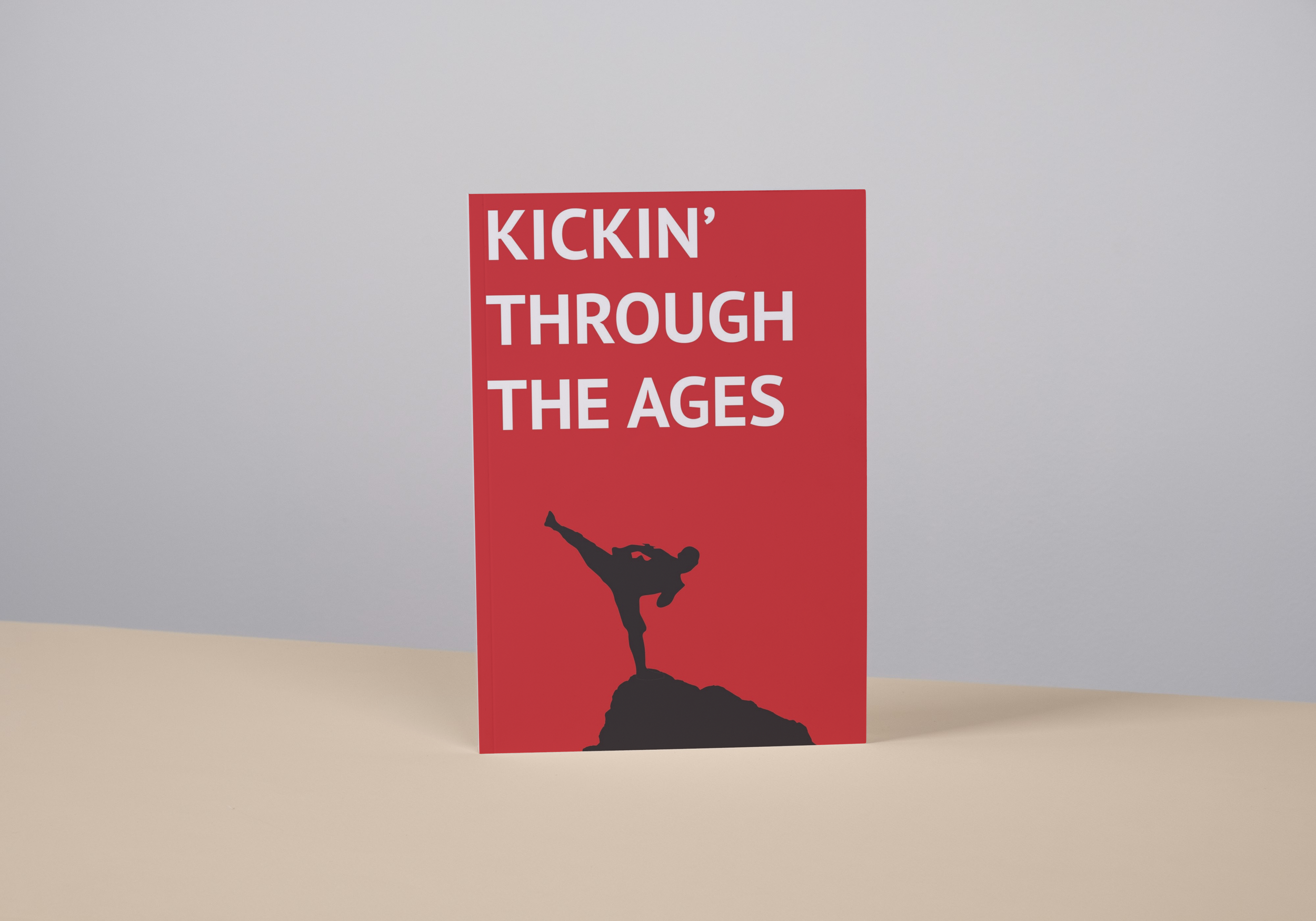
The cover is bold and minimal, displaying the title, a silhouette on a rock mid-kick, and nothing else.
To fully experience the design, please view the video in full screen.