
Carnage Typeface Book
Custom Type Design
Self-directed academic project
Tools: Adobe Illustrator, Adobe InDesign
December 2018
During my metal-rock phase in college, it didn't just change what I listened to. It changed how I was thinking about design. The aggression, the chaos, the feeling that something could fall apart at any moment, and I wanted to turn that into a typeface. Carnage was the result.
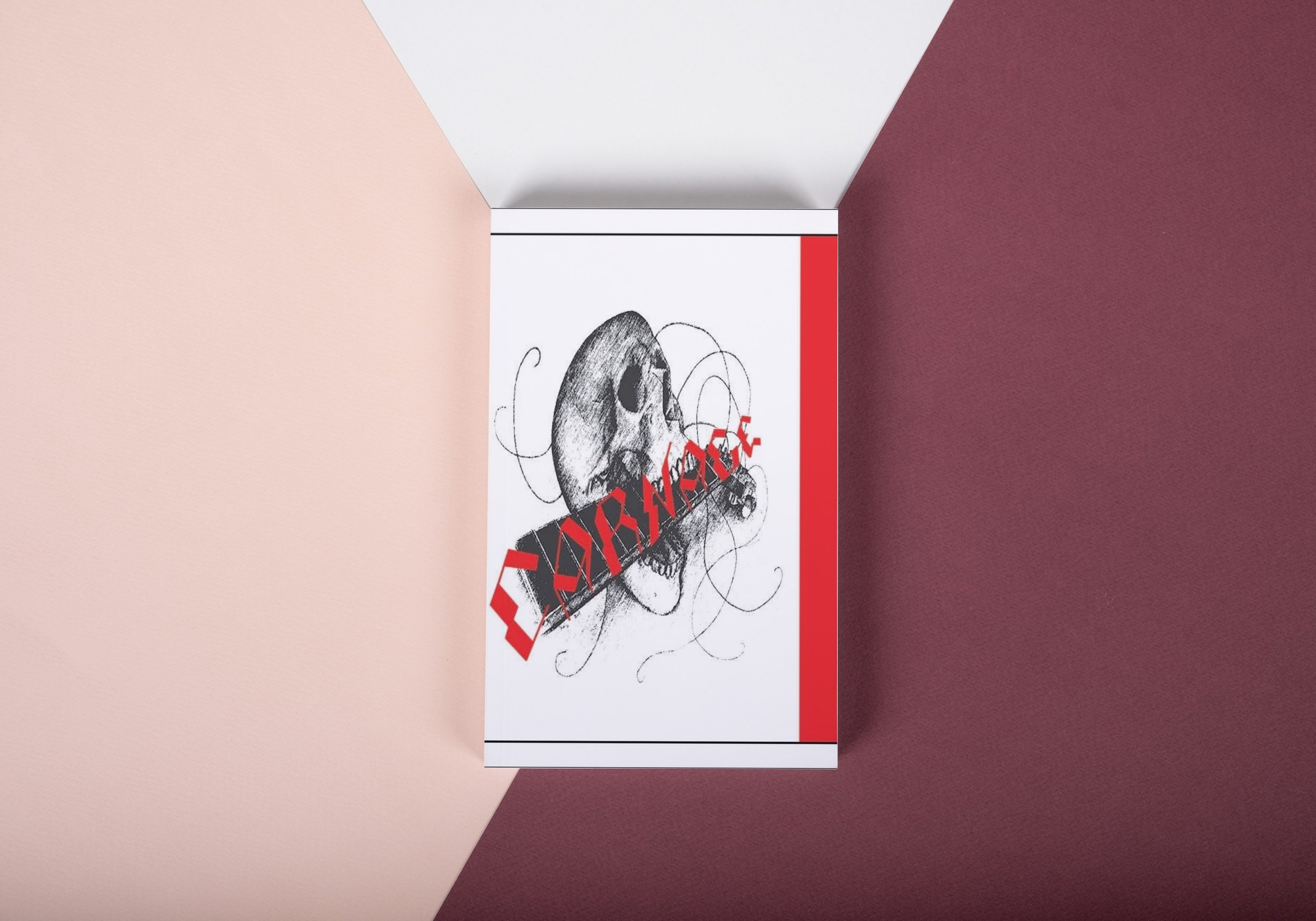
The concept behind Carnage is destruction. Every letterform was designed with no round curves, only straight slants, jagged edges, and bent forms that look like someone crumbled or smashed them. The goal was for the alphabet to feel like it had been through something. Like it survived something. When you look at a letter in Carnage, it shouldn't feel safe or settled. It should feel like it's about to break apart. Near the end of the book is a full alphabet spread showing every letterform in the Carnage typeface, A through Z, laid out in rows so you can see the system as a whole and how consistently the concept holds across all characters.
The red, black, and grey palette runs throughout the entire book, aggressive, high-contrast, and deliberately uncomfortable. It's the same energy as the music that inspired it.
To fully experience the design, please view the video in full screen.