Permission to Put Yourself First
Editorial Guide
Client: Aging for Purpose
Tools: Adobe Illustrator, Adobe InDesign
November 2025
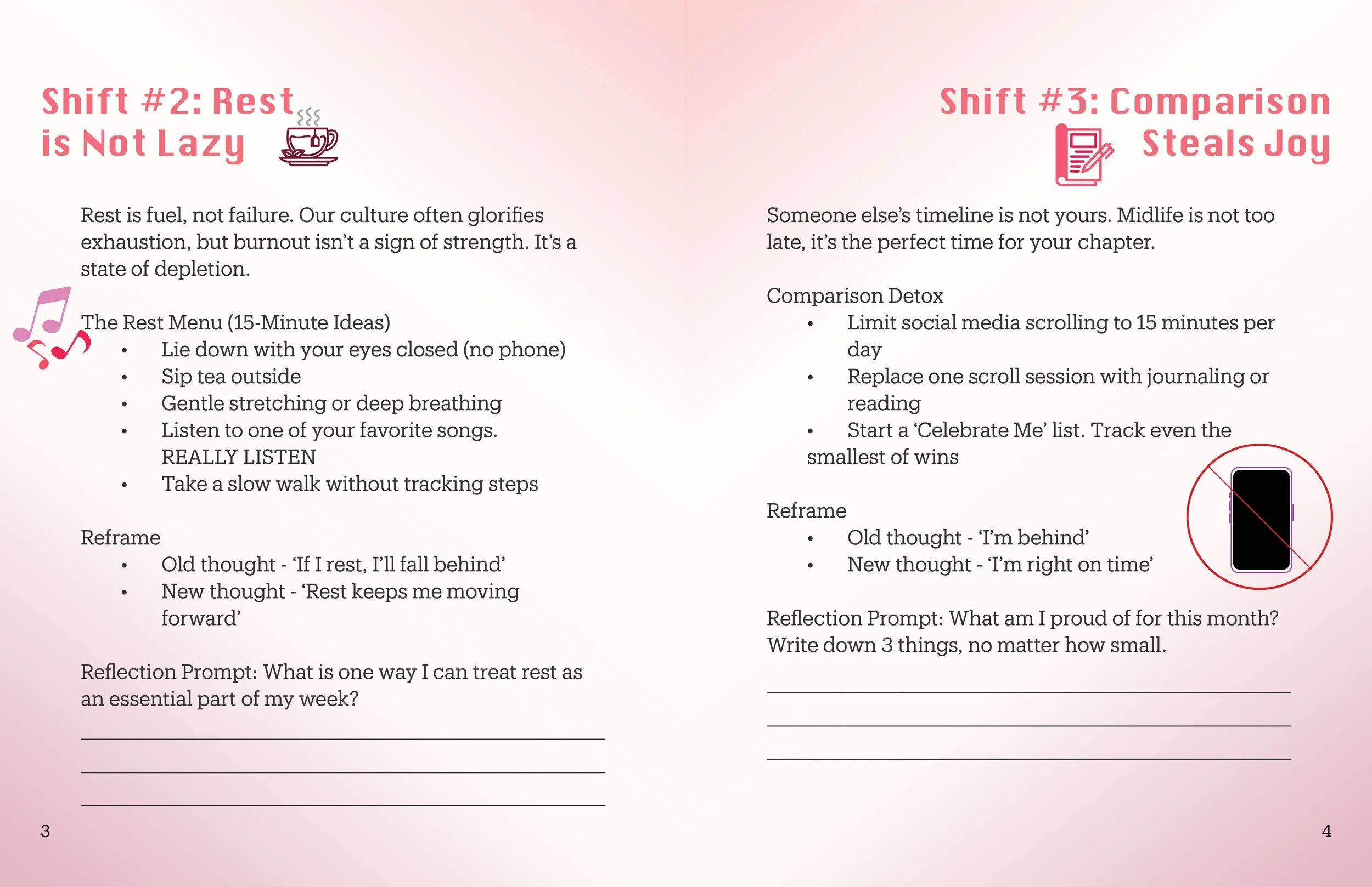
A client reached out to me, asking for a downloadable wellness guide for her business, Aging for Purpose, an independent wellness program designed to help midlife women live with more intention and less guilt. She already had the content written and a clear picture of who she was talking to. She just needed someone to make it feel the way it was supposed to feel.
That was the real brief. The words were already there; my job was to make the design do the emotional work before the reader even processed them.
The color palette wasn't something I had to figure out from scratch. I pulled directly from her existing brand colors and built a pink-to-red gradient system that ran through everything — headings, section backgrounds, icons, illustrations. The goal was for someone to open the guide and immediately feel like they were already inside her brand, not looking at something made separately.
The layout was structured around three mindset shifts, each one ending with a reflection prompt for the reader to write in. That meant the design had to work two ways at once — easy to read through, but also comfortable enough to pause in and sit with. I used generous white space and clear section breaks so nothing felt rushed.
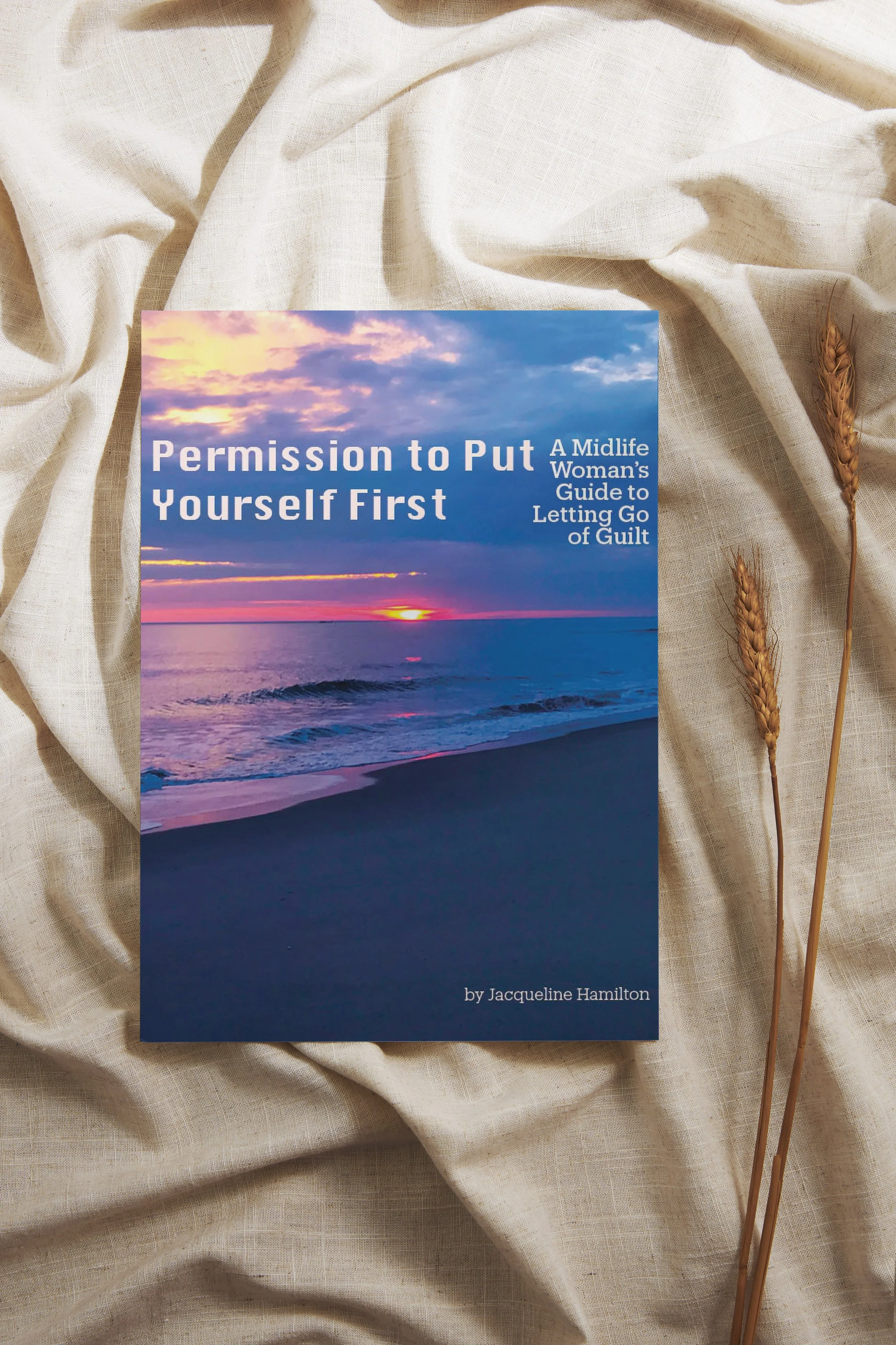
Every font choice, every icon placement, every background tone was made with one question in mind — does this feel warm? The handwritten-style headers give it a personal, journal-like quality. The soft gradients keep it light. The closing spread pairs the final words with a full-bleed beach photo, so the last thing you see before you close the guide is open water and sky. The final deliverable was a print-ready PDF designed to be shared as a free resource for her audience. It was a freebie project, but I treated it like it wasn't.